If you’ve recently updated your Uber app, you’ll notice that it’s got a fresh app and logo design. This rollout has been announced in an article posted by Uber CEO and Co-Founder Travis Kalanick, where he mentioned that the new look and feel “celebrates our technology, as well as the cities we serve.”
The new logotype gets rid of the old design’s curves, and is now replaced with a sharp and edgy typeface.
![]()
It also brings together the “bit”, supposedly representing Uber’s complex, precise, and advanced technology, and the “atom”, as the company’s way of humanizing the brand by having it represent the cities and the people it serves. This supposedly human side of Uber has been the driving force behind the different colors and patterns of its new designs.
Yep, that’s a plural. Apparently Uber’s rebranding comes with having a different set of patterns specific to which country you are in. The designs and color palettes are customized based on the culture of each country where Uber operates.
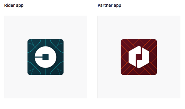
To make things more complicated, the rider app icon would be different from the partner (driver) app icon. You can see them below.