OPPO has never been shy about promoting itself as a selfie-centric brand, and this time the OPPO F3 Plus might be its biggest device ever. This 6-inch smartphone packed with powerful specs appears to bring a lot of premiere design and functionality. These both serve as an effective foundation upon which its signature dual front-facing camera stands.
Updated: Oppo F3 Plus Review

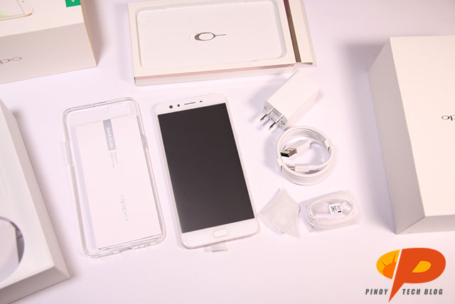
As the clear successor to the F1 Plus, the OPPO F3 Plus already impresses just by the box packaging alone. It takes a white overall design with shimmering gold font. Of course, the green OPPO logo doesn’t miss a beat and stands out. Upon opening it, we get:
- OPPO F3 Plus unit (1 pc.)
- Micro-USB Charging Cable (1 pc.)
- Travel Charger (1 pc.)
- Clear Jelly Case (1 pc.)
- Quick Guide (1 pc.)
- Important Information Guide (1 pc.)
Design and Construction
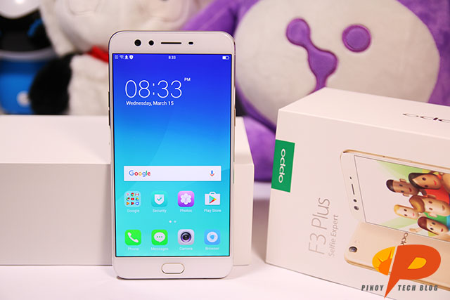
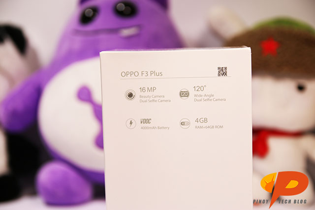
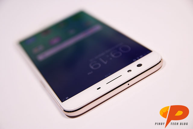
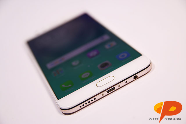
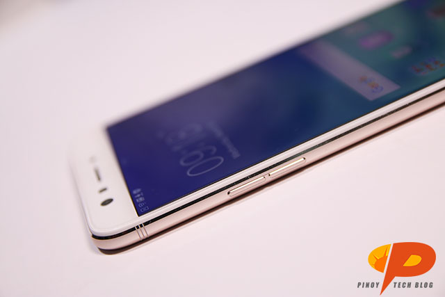
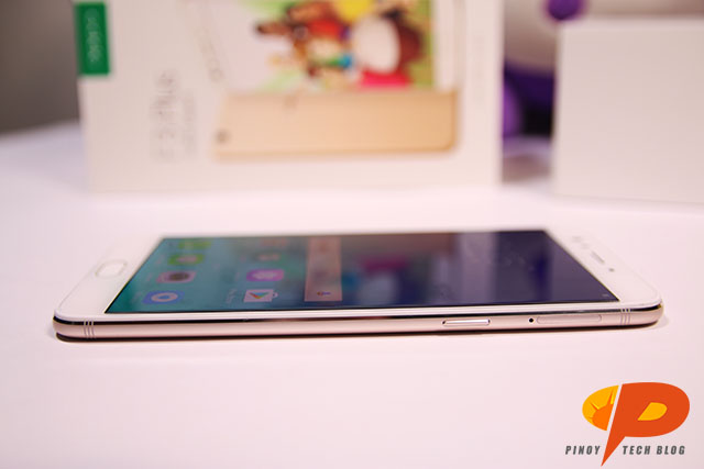
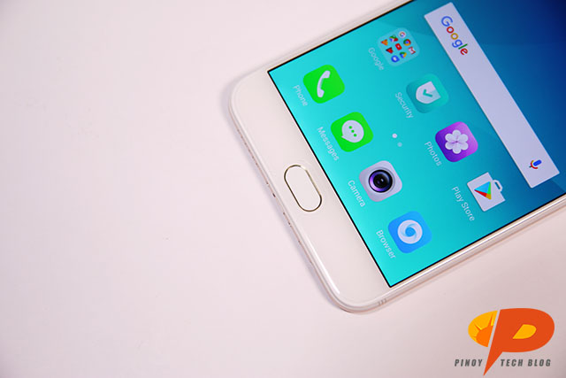
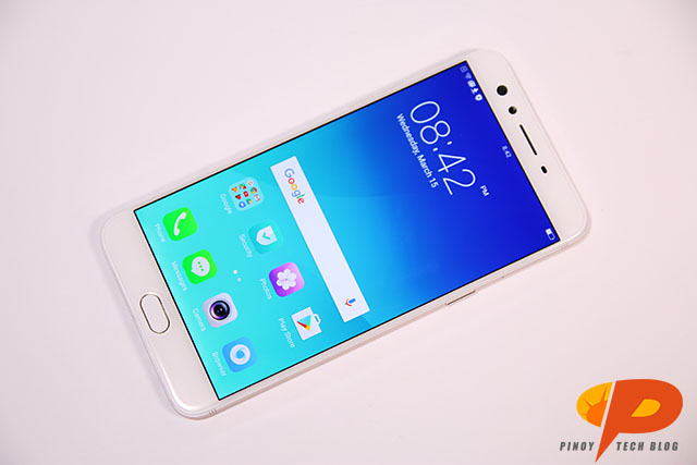
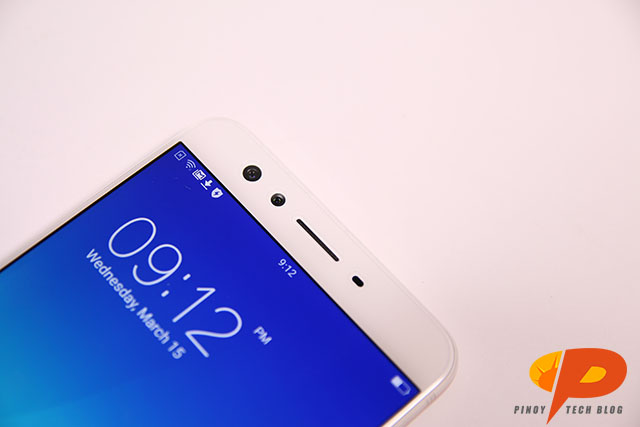
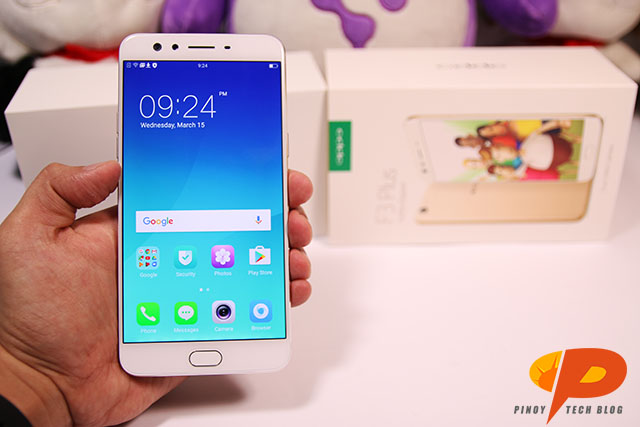
Design-wise, the F3 Plus actually looks like an iPhone, especially with its minimal design. When I say minimal, of course I mean that by default, it looks like there’s only the white bezels, and the white button. The look is clean and simple. In addition, OPPO spreads the features of the phone appropriately. For example, on top of the display are the earpiece, front sensors, and the two front cameras. I cannot stress how important this top part is, since this is where we’ll find the dual-lens, Selfie Expert, 120-degree selfie/groufie camera. Clocking in at 16-megapixels for one lens, and 8-megapixels for the wide angle lens, users may look forward to taking solo shots in high-quality, or group shots where nobody is excluded. To balance this all out, the bottom of the display contain the capacitive buttons, flanking the middle fingerprint scanner.

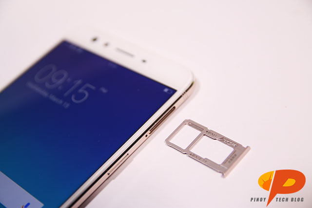
Furthermore, the left-hand side of the phone houses the power/lock button, plus the hybrid card tray that houses two Nano-SIM cards and a microSD card. Inversely, the right-hand side features the volume buttons, which means that you won’t accidentally lock your phone if you’re just using a single hand. All ports situate themselves at the bottom, primarily the headphone port, the micro-USB port, and the speaker grills. My only contention, really, is why they chose to stay with a micro-USB instead of a USB-C. Last but not least, the back portion of the device features the dual-tone LED flash alongside the main camera module. Interestingly, this also mimics the design of the iPhone, particularly the iPhone 6.
For now, I’ll admit that while the entire feel of the handset isn’t anything utterly original, I also don’t see the need for OPPO to change anything. To drastically alter the appearance of the F3 series would equate to alienating their current fanbase.

OS, Apps, and UI
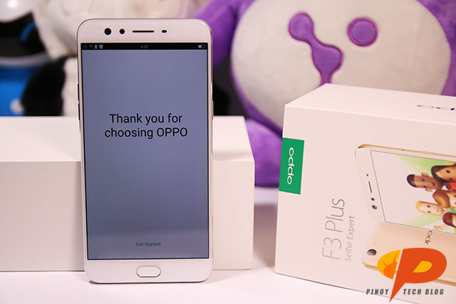
For this iteration of the OPPO flagship, the ColorOS skin for the Android remains. However, when I think about it, this setup looks almost exactly the same as the OS for the OPPO F1s. This simply means that they didn’t change much for the F3 Plus, which could honestly be both good and bad, depending on the audience. If it’s someone hoping for something new from OPPO, they’re sore out of luck. On the flipside, if it’s someone who just wants an upgrade to their OPPO phone, the familiarity feels rewarding.
Upon opening the device, the Google apps stand ready for use, already pre-installed. Additionally, a few system apps and tools plus Facebook appear almost immediately, which feels very handy. Overall, the original 64GB internal storage cuts down to a usable storage space of 52.27GB. Honestly, not a bad number.
So far, the OPPO F3 Plus impresses in terms of design and feel, but I simply can’t shake this idea that nothing feels completely new. However, this opinion might change, especially since the true draw of the OPPO F3 Plus is the 120-degree wide angle, dual lens, beautification-focused, 16-megapixel (plus 8-megapixel wide angle lens) Selfie camera. We may actually need to forget about the rest of the specs, especially with a smartphone that touts such a powerful pair of front cameras.
More photos of the OPPO F3 Plus: